The Colors Defining 2026: A Look at the Year’s Top Picks
Dec 16, 2025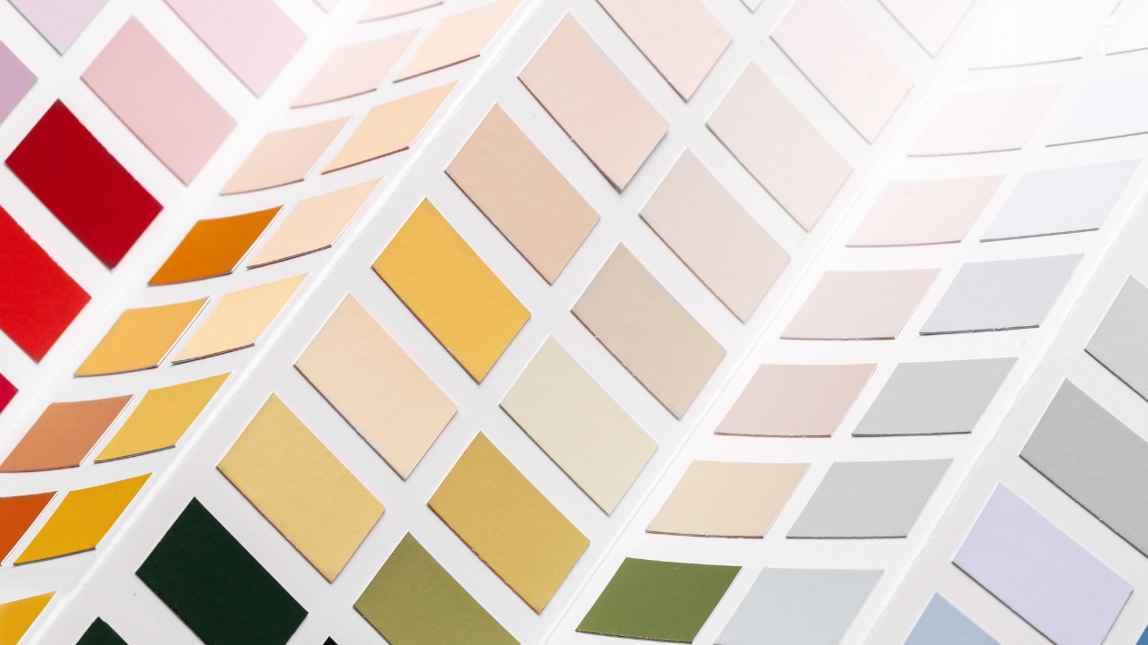
Let’s be real. Colors of the Year get a lot of buzz, but what they actually represent can feel a little disconnected from how we use color. These annual picks are part forecast, part branding moment, and part mood reading. When done well, they capture a cultural shift. But they also need context.
This year, we’re seeing a surprising mix. Some brands leaned into richness and emotion. Others kept things safe. And one very influential voice decided 2026 should be… white. We'll get there. First, let’s zoom out and look at what these choices are saying, together. We’re rounding up the 2026 Color of the Year picks from Pantone, Behr, Sherwin-Williams, and the Color Marketing Group (North America), and thinking about what they reflect about the direction of design, and what people are really craving right now.
Behr’s 2026 Color of the Year: Hidden Gem (N430-6A)
Hidden Gem brings us back into color with a smoky jade that blends blue and green in a way that feels both grounding and a little mysterious. Behr calls it a “new neutral,” which feels right for the moment. It’s understated but full of depth, expressive without being overpowering. Its versatility makes it easy to imagine across a wide range of styles, from eclectic and collected to more traditional or transitional spaces.
It reflects a growing desire for color that feels calm but not flat, tones that offer emotional presence and a sense of balance. As design continues to lean into warmth, nature, and softness, Hidden Gem suggests that people want spaces and objects that feel thoughtful, layered, and quietly personal.
Sherwin-Williams 2026 Color of the Year: Universal Khaki (SW 6150)
Universal Khaki is a warm, mid-tone neutral that feels familiar and easygoing. It may not be the most exciting pick at first glance, but that’s part of its appeal. It’s a steady, usable base that fits into just about any space without fuss. Think of it as a dependable backdrop rather than a statement, which makes sense in a moment when many people are craving simplicity and ease.
While understated, it still says something about where design is heading. Universal Khaki reflects a broader interest in returning to foundational elements, slower design, natural textures, and a renewed appreciation for handcraft and skill in an increasingly digital world. It’s a quiet nod to heritage, tradition, and comfort, all wrapped into one unassuming shade.
CMG’s 2026 Key Color for North America: Bio-Graphing
Now here’s where things get conceptually interesting. Bio-Graphing, from the Color Marketing Group, isn’t just a pale blue—it’s a design philosophy. This soft, low-chroma shade speaks to a desire to reconnect with nature, rethink our relationship with technology, and reawaken the senses. It’s about detox and reset, both visually and emotionally.
The color offsets the sterility often linked with tech by introducing softness, imagination, and a sense of quiet clarity. It reflects a broader shift toward slower, more intentional design, work that values balance, sensory engagement, and the blending of natural and digital influences in thoughtful, human-centered ways. Conceptual as it may be, Bio-Graphing is perfectly in step with the year’s other picks, all circling themes of wellness, connection, and emotional grounding.
Pantone 2026 Color of the Year: Cloud Dancer (11-4201)
Pantone surprised just about everyone this year by choosing a white, Cloud Dancer, a soft, airy white that’s all about calm and clarity. It’s the first time they’ve ever named a white as their Color of the Year, and it’s making waves for how understated it is. According to Pantone, Cloud Dancer is about emotional reset. It offers a moment of stillness in a busy, overstimulated world. It’s minimalist, but not cold. The kind of white that feels like linen blowing in the breeze, not a sterile backdrop.
In terms of sentiment, it fits into the broader conversation around wellness, clarity, and intentional design. But visually, it’s an outlier. At a time when the design world is leaning into color again as well as pattern layering, expressive palettes, and a welcome return to visual richness, Cloud Dancer feels like a whisper. Some might see it as a blank canvas. Others might see it as a missed opportunity. Either way, it’s clear that 2026 is less about following one trend and more about responding to what feels meaningful and alive in your work.
Trend Watch: What These Colors Tell Us About 2026
Looking across the board, the message is clear: we want comfort, calm, and spaces that feel like they’re truly made for living. There’s a collective leaning into grounding tones, colors that help us reset, reflect, and reconnect. Whether it’s the quiet depth of Hidden Gem, the sturdy warmth of Universal Khaki, or the conceptual calm of Bio-Graphing, the trend points toward design that supports emotional wellness and everyday ease.
At the same time, these choices reflect something deeper, a return to authenticity, craft, and personal story. As designers and consumers move away from fleeting trends, there’s a stronger focus on materials, mood, and meaning. Color is no longer just aesthetic, it’s a tool for expression and connection. Whether bold or barely there, it’s being used more intentionally than ever to create spaces that feel grounded and quietly personal.
What This Means for You
As a designer, this year’s picks aren’t meant to tell you what to do. They’re clues. Data points you can pull from, remix, or completely challenge. What they confirm is that the market is open to emotional design again. Work that isn’t just polished, but personal. Color that communicates.
So whether you’re designing textiles, collections, or interiors, think of these hues as options, not orders. If Cloud Dancer feels too quiet, that’s fine. If Hidden Gem feels like your whole mood board, lean in. Use what resonates and leave the rest. You don’t need permission to design with heart—or with color.
Next Steps
If you’re looking for more than just inspiration and you want to turn these insights into work that’s truly your own, our Kindly Woven Studio Intensive was made for you. This program is built for designers who are ready to move from idea to execution, with a clear path toward creating products that fit within the interiors market. You’ll get guidance, community support, and practical tools to help you shape your creative direction with clarity and purpose.
In this program, we dig into how to translate trend direction into meaningful design work. You'll learn how to create collections with depth, build a portfolio that reflects your voice, and take the steps needed to confidently launch your product into the interiors world.
Enrollment opens in January. Join the waitlist now to be the first to know when doors open.