Moody Hues & Modern Heirlooms: A New Way to Use Color with Confidence
Jul 29, 2025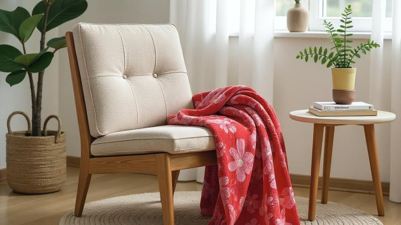
Color is shifting in interiors, and it’s not about trend cycles. It’s about how people want to feel in their homes.
Designers and homeowners alike are choosing colors that are softer, deeper, and more personal. From earthy greens to inky blues to sun-warmed terracotta, we’re seeing palettes that create atmosphere and emotion—not just contrast.
This approach to color isn’t about drama. It’s about choosing tones that bring quiet depth to a space.
What We Mean by “Moody” Color
Moody doesn’t mean dark for the sake of being dark. It refers to hues with depth and softness—colors that feel rooted, calm, and quietly expressive. Think olive instead of grassy green. Rust instead of true red. Chalky navy, golden ochre, stormy plum.
These tones bring dimension to a space without overwhelming it. They shift subtly in different lighting. They pair well with both old wood and clean lines. And they hold up beautifully over time, feeling considered rather than trendy.
A Fresh Take on Tradition
What’s especially interesting is how these moody palettes are bringing traditional design elements into a more current conversation.
We’re seeing vintage florals in new colorways. Muted plaids in fresh scales. Deep green trim and burgundy tile being used in rooms that still feel open and modern.
There’s a move toward mixing old and new, soft and bold. A dining space with mismatched candleholders, soft shadows, and a deep-toned table runner. A spare bedroom with an antique side table and color-drenched bedding. These choices feel less about styling and more about story.
How Gen Z and Millennials Are Shaping the Mood
This shift isn’t happening in the design world alone. It’s happening in how people, especially younger generations, are choosing to live.
There’s been a noticeable return to gathering through hosting friends, setting tables, and curating spaces with intention. You’ll see dinner parties with taper candles and full dish sets. Handwritten place cards. Collected flatware. And color choices that reflect mood, not default palettes.
Moody colors fit right in. They show up in the table linens, the painted accent wall, the one bold piece layered into a quiet space. It’s thoughtful, expressive, and deeply personal—and it’s influencing the way people furnish and finish their homes.
Where Wovens Belong in the Conversation
Woven textiles offer an ideal way to bring moody color into a space. Because of their texture and construction, they give color a softness and dimension that flat materials can’t. They don’t shout. They settle in.
At Kindly Woven, we’ve spent the past year designing a collection that meets this exact moment—where color is expressive, materials are meaningful, and home is something you build over time. These blankets are patterned and bold, but meant to be lived with. Used. Folded. Draped and softened and loved.
They’re made to work with the space you already have.
If You’re Curious About Color, Start Small
You don’t have to repaint a room to explore this direction. Try adding a single piece with presence. A blanket in a dusky red or softened mustard. A woven check in stormy blue. Something with both color and character.
Often it only takes one layer to change how a room feels.
Join the list or follow us on Instagram for the full collection reveal on August 18.