Building Colors: How Kindly Woven Builds a Palette That Feels Like Home
Aug 12, 2025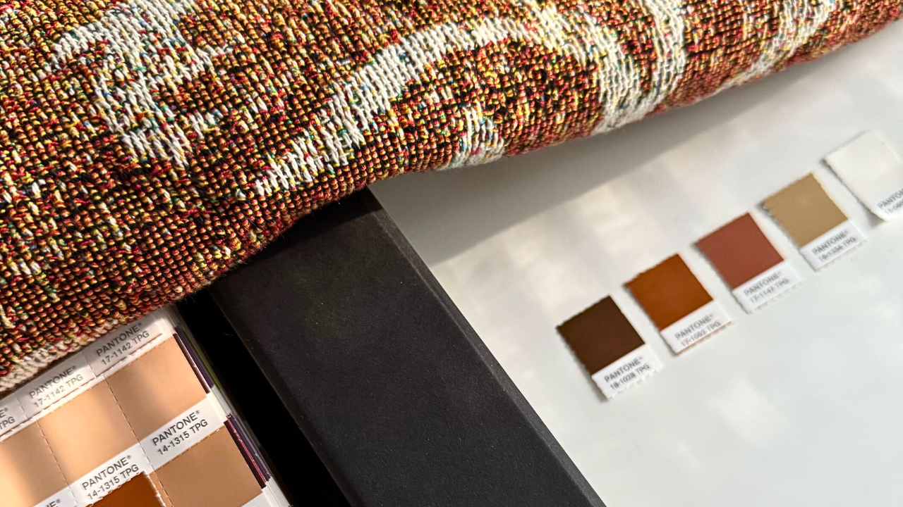
At Kindly Woven, color isn’t just a design decision. It’s a layered process. One that’s trend-driven and emotionally tuned. It’s grounded in data, shaped by intuition, and ultimately transformed by the loom itself.
We begin each season looking ahead: at what color forecasters like Color Marketing Group and Pantone are predicting, at what’s rising in both high-end and mass-market interiors, and at what we sense people are ready for. Then we translate that insight into something that feels lasting—not just of the moment.
From first swatch to final fringe, our colors are chosen with care. Here’s how color comes to life at Kindly Woven.
Research, Forecasting, and the Role of Story
Before a palette ever hits the yarn table, it’s researched. We study what’s next—carefully watching color shifts across industries, platforms, and price points. We look at what colors are moving down from luxury and what’s bubbling up through the creative underground.
From there, we bring in the human layer: the artist’s perspective, the mood of the design, and the room it’s meant to live in. We ask how color can express a story—not just fill space.
What looks vivid in digital renderings may soften in yarn. What feels trendy in concept may need grounding in execution. We make those choices deliberately, always asking: what colors will feel right in a room six months from now—and six years from now?
Translating Forecast to Fiber
Once we’ve built a palette that’s both trend-aware and emotionally resonant, we face our next challenge: translating it into woven structure.
We don’t dye to order. We work within a tight, pre-dyed yarn library—both for sustainability and quality. That means each color must be reverse-engineered from available yarns, often through blends and layering.
What starts as a bold chartreuse may become a softened gold woven from alternating thread paths. A clay tone might be created through unexpected mixing of rust, gray, and neutral base fibers.
It’s part design, part limitation, and part magic.
When Color Becomes Cloth
Woven color doesn’t sit on the surface—it becomes the surface. That means it changes in the light, shifts in drape, and interacts with its surroundings.
A deep green might pull cool in morning light and warm at night. A rust stripe might feel earthy on a wood bench but bold on white bedding. This movement isn’t a flaw. It’s the beauty of woven color in real life.
That’s why we review every sample in context: folded, draped, styled, lit. It’s not just about color accuracy—it’s about resonance.
Final Touches, Color in Use
Once the weaving is complete, the finishing process helps bring the palette to life—softening fibers, enriching tone, and allowing us to add trims and labels that complement rather than compete.
Each final piece is more than a color story. It’s a color experience—meant to feel as good as it looks. Designed to layer, not overpower. To hold the room quietly, but with confidence.
Why It Matters
At Kindly Woven, color doesn’t happen by accident. It’s forecasted. It’s interpreted. And then it’s reimagined through the language of yarn.
Our blankets don’t follow a trend report verbatim, but they’re deeply informed by the conversations happening in design, in culture, and in the homes we imagine these pieces living in. If you believe in color that feels intelligent, expressive, and quietly on time—we think you’ll love what we’re weaving.
Join the list or follow us on Instagram for the full collection reveal on August 18.